Category: Infographic
-
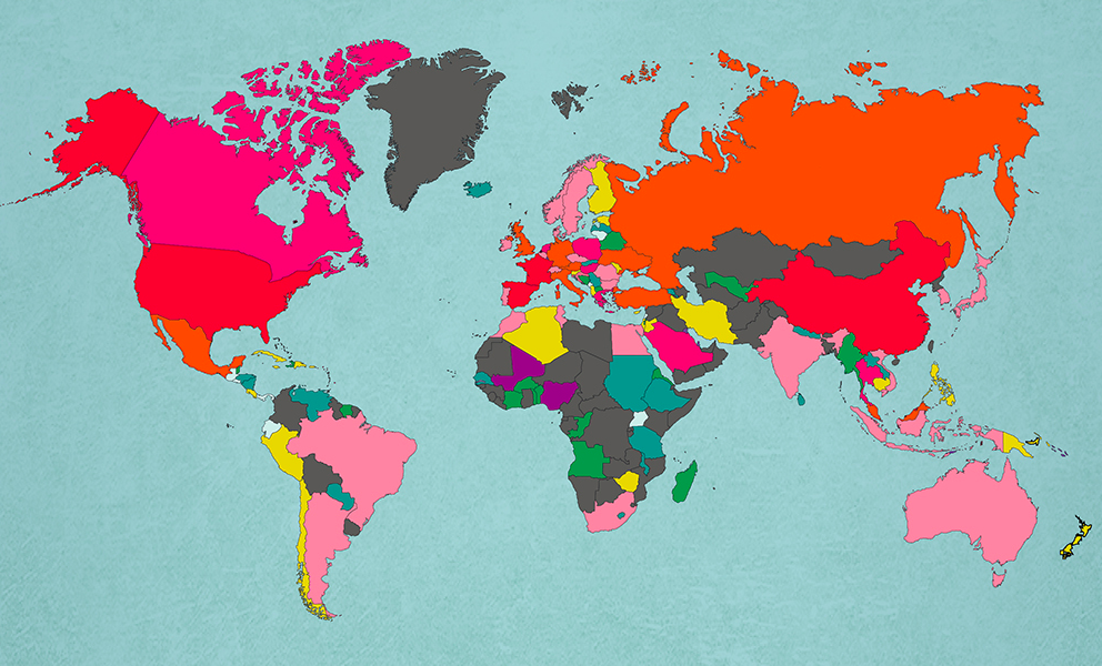
The Most Popular Countries In The World
–
I love maps, and especially this one. According to MoveHub.com, these are the top 50 countries by yearly visitors. Based on this, how about we take a trip to Mali, Nigeria, or East Timor? I was THIS close to going to East Timor last year while hanging out in Flores, Indonesia.. darn! Top 50 most…
-
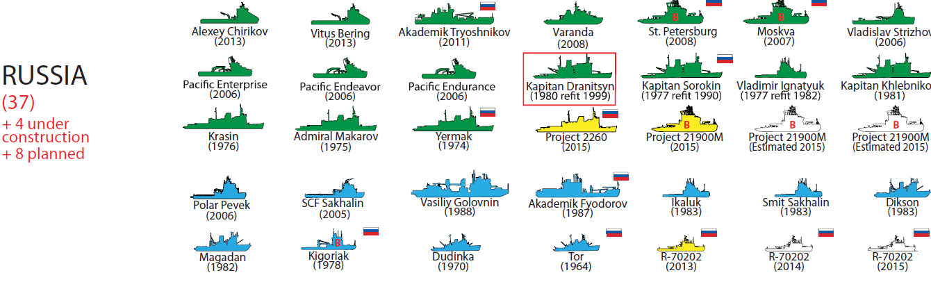
Infographic: Major Icebreakers of the World
–
Great infographic today thanks to the US Coast Guard – a comprehensive review of the world’s major icebreakers. My next task, sail on all of them! From the United States Naval Institute: “The Coast Guard Office of Waterways and Ocean Policy (CG-WWM) began producing the chart of major icebreakers of the world in July 2010.…
-
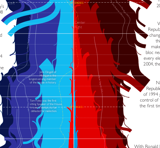
Infographic: XKCD’s A History Of The United States Congress
–
Great big infographic from favourite cartoonist Randal Munroe of XKCD. A look at american politics over the years..
-

Everything You Need to Know About Kitchen Knives
–
Need a new kitchen knife? Here’s everything you need to know. I love these all inclusive guides, because they give me the tools to make a solid, informed decision. I try not to buy a lot of stuff, but when I do buy something, I like to know exactly what I’m getting, and make sure…
-
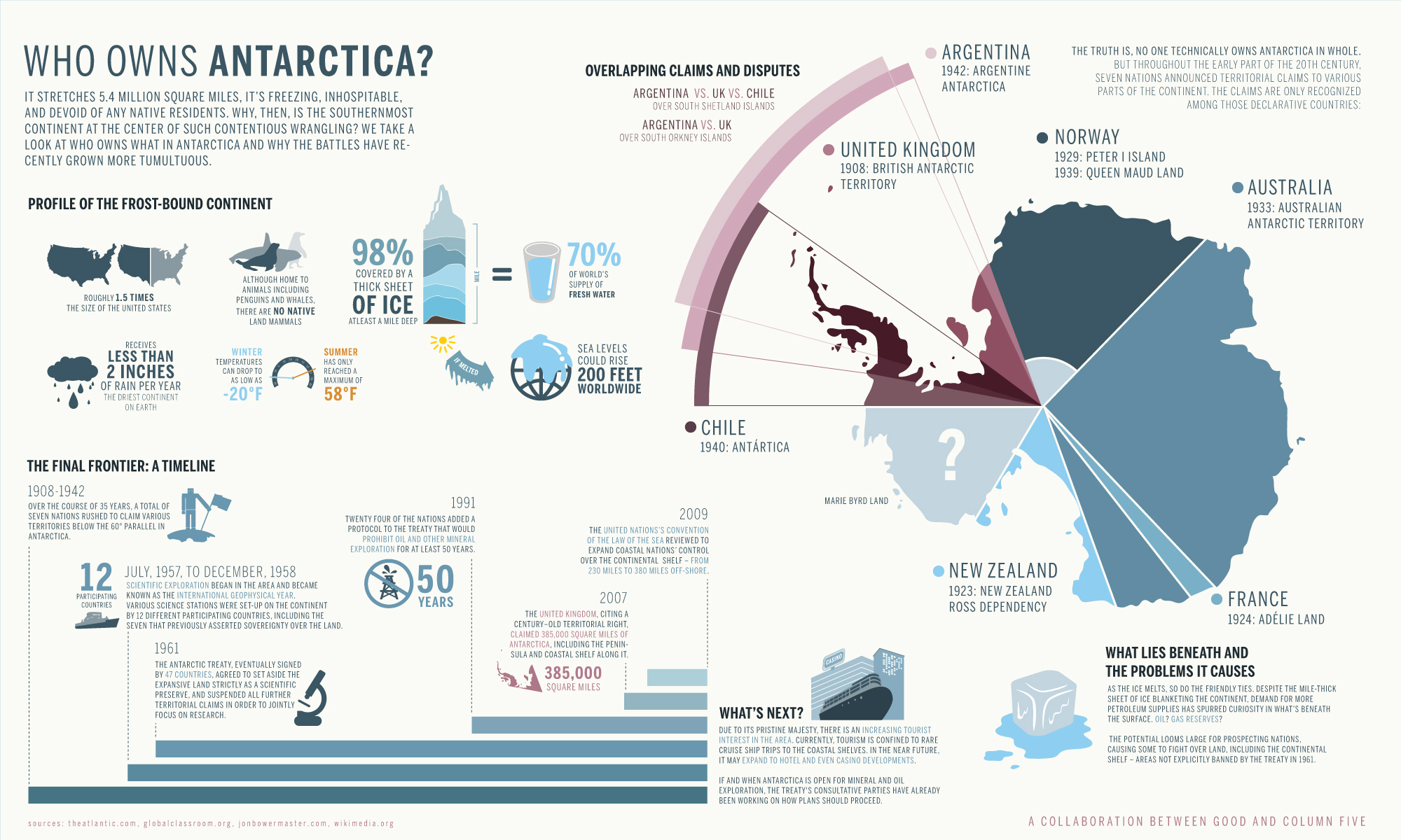
Polar Infographic: Who Owns Antarctica?
–
Great Antarctic infographic for today – who owns that giant continent, anyway? Courtesy of GOOD
-
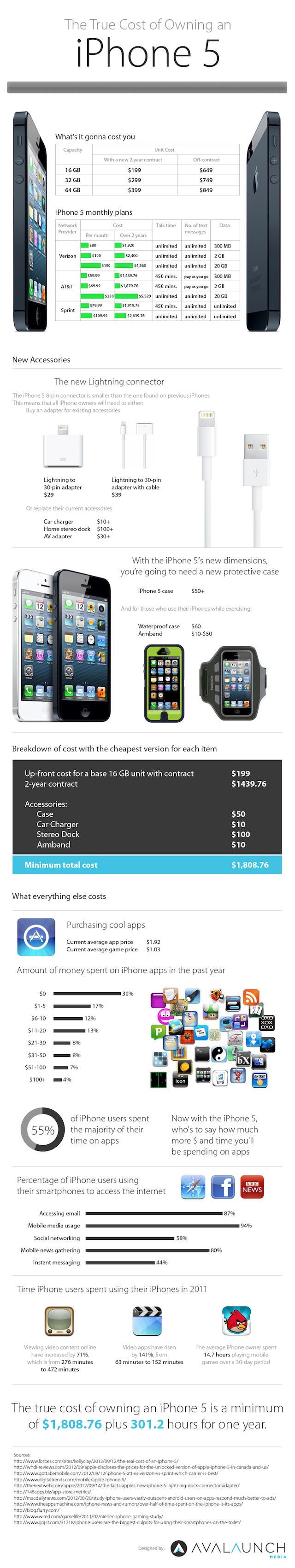
Infographic: The True Cost of Owning an iPhone 5
–
Thanks to snazzily-named internet marketing firm Avalaunch for this handy infographic breaking down the ownership cost of an iPhone5… Avalaunch via Gizmodo
-
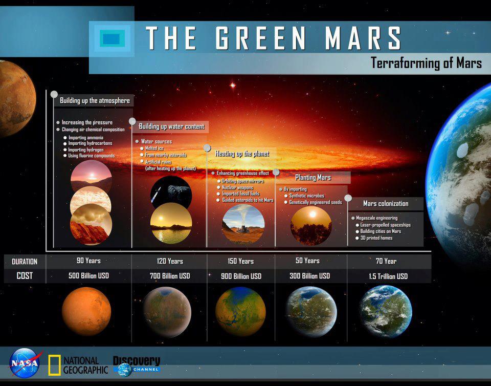
Infographic: Terraforming Mars
–
With the Curiosity Rover set out on its mission on Mars, we’re one more step closer to sending humans there. Here’s an interesting infographic from Discovery and NASA going over a possible budget and timeline for terraforming the red planet to create a habitable environment. Very very interesting….
-

Infographic: Inside Huge Mars Rovers Sky Crane Landing
–
Inside Huge Mars Rovers Sky Crane Landing Infographic | Mars Science Laboratory & Curiosity Rover Landing Plan | NASA Mars Missions & Rovers on Mars | Space.com.
-
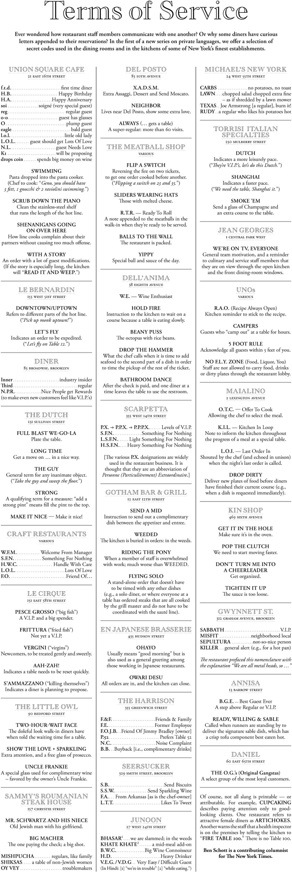
Infographics: The Secret Language of NYC Restaurants
–
Although I unfortauntely didn’t learn much of it during my brief stint as an NYC waiter, there’s a whole secret language in the restaurant business. This excellent NY Times Infographic breaks it down.. Terms of Service in New York Restaurants – Graphic – NYTimes.com.
-
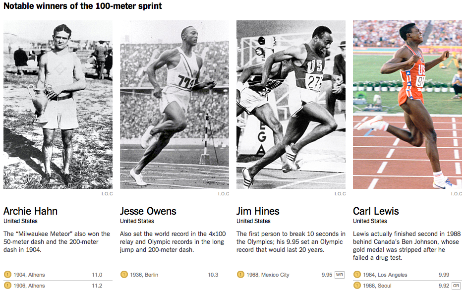
Faster and Faster at the Olympics
–
The NY Times recently posted this excellent explainer feature documenting how Olympic sports have gotten faster and faster over the years. The piece focuses on the Men’s 100-Meter Sprint, but covers other important events, like the 100 meter freestyle swim, and long jump. From NY Times: Based on the athletes’ average speeds, if every Olympic…
-
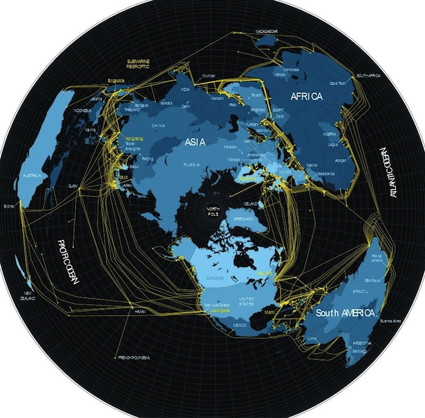
Infographic: What the Internet Actually Looks Like
–
Great post from The Atlantic today, mapping out the physical connections of the internet. Hey, that AT&T building is just down the street from my apt in NYC – so why is my internet so damn slow! What the Internet Actually Looks Like – Megan Garber – The Atlantic.
-
Explainer: The Crisis of Credit Visualized
–
Easily the most clear explanation of the credit crisis I’ve seen, with nifty infographics and great narration. Thanks to Jonathan Jarvis at Crisisofcredit.com. The Crisis of Credit Visualized via The Crisis of Credit Visualized – HD – YouTube. Found via Reddit
-
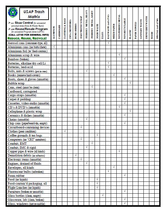
Infographic: Recycling in Antarctica
–
Recycling in Antarctica seems like a complex job – but somebody’s got to do it. And hopefully it will be ME sometime soon. For now, here’s an interesting matricx of the various recycling rules “on the ice”… Recycling in Antarctica – Boing Boing.
-
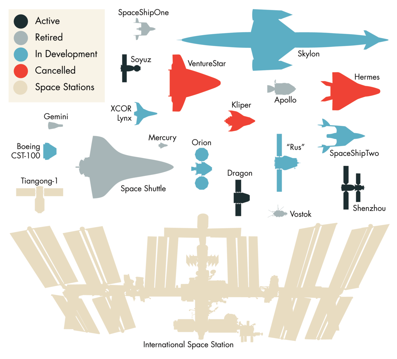
Infographic: Spaceships to Scale
–
Thanks to Science journalist Ananyo Bhattacharya for this awesome infographic of past, current and future space vehicles, drawn to scale. Found via BoingBoing. Cool – got call out from @BoingBoing http://t.co/nFlBuHsR << Je suis arrivé (ht @BL_Owens) — Ananyo Bhattacharya (@Ananyo) June 19, 2012
-
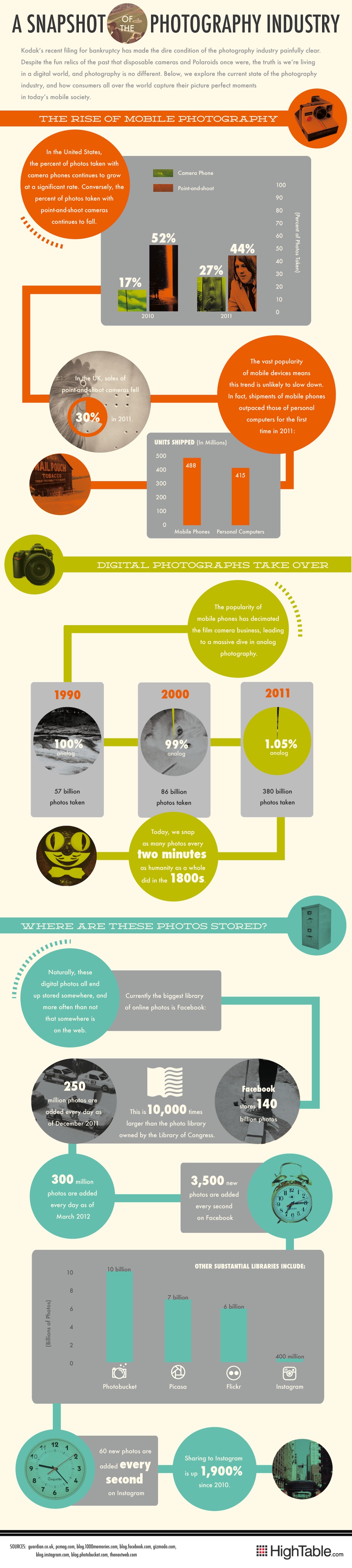
Infographic: The Rise of Mobile Photography
–
I use the camera on my beloved iPhone 4 as much – if not more than I use my proper digital cameras – a Canon S-100 and Canon 5Dmk2. My iPhone is always with me and ready, and it’s always connected to the internet. I can shoot, edit, and share all on one device. I’m…
-
Introducing my Visual Resume
–
Infographics have gotten increasingly popular recently, and in response, a number of websites have cropped up to allow users to convert their job resume into a snazzy infographic. Using Visualize.me, I’ve created my own version. After you’re done being impressed with the infographics and years of experience I have working in interactive media, shoot me…
-
Infographic: What Is The Current State Of The Internet?
–
What Is The Current State Of The Internet? [Infographic] – PSFK.
-
Infographic: Building The Case For Resunate – Does a Non-Traditional Resume Limit Your Odds?
–
Another job-related infographic for today – Does sending out one of those trendy Infographic Resumes, like what vizualize.me creates limit your chances of being positively evaluated by an automated Applicant Tracking System? This certainly makes the case to use Resunate, which lets you optimize your text based resume in real time to perform agains ATS’s….…
-
Infographic: The Anatomy of an Effective Homepage
–
When talking with my marketing clients, homepage conversion optimization strategy is always a hot topic. Kiss Metrics provides this handy infographic to breakdown some of the critical elements of a homepage. Importantly, they highlight the importance of a clear call to action. The Anatomy of an Effective Homepage.
-
Infographics: Portrait of the Young Grad as an Analyst
–
As far as visualizing personal data goes, Liz Fosslien’s site is one of the better ones I’ve seen lately, second only to Nicholas Feltron. The intro to her “Portrait of the Young Grad as an Analyst”, and associated content is great: So you’re an analyst. This means three things. One, your family and friends have…
-
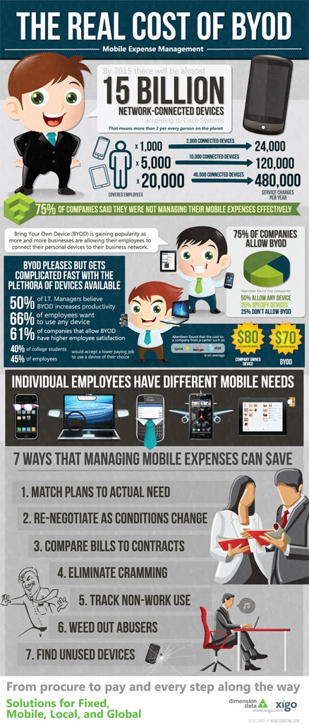
Bring Your Own Desktop – My Kind of Workspace
–
Today, Xigo published this interesting graphic on the “Bring Your Own Desktop” office scheme. Your company provides you the office space and desk space, and you’re free to bring whatever tech you need to get your job done. This rings true for my current work setup. At my current job, I use my own Macbook…
-

Infographic: The Worth of an MBA
–
Thanks MBAOnline for reaching out to me with this nifty linkbait infographic. Yes, it is actually relevant to me – in considering going to grad school or not, the actual value of the degree was a major consideration of mine. Still haven’t gone, still not sure it’s worth it. What do you think? From MBAOnline.com
-
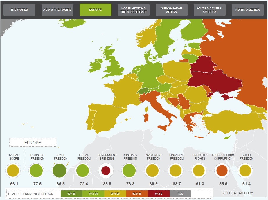
Infographic: The Heritage Foundation Index of Economic Freedom
–
Another great one from Column Five Media: The Heritage Foundation Index of Economic Freedom For over a decade, The Wall Street Journal and The Heritage Foundation have tracked economic freedom around the world with the Index of Economic Freedom, creating 10 benchmarks that gauge economic success. This interactive heat map created with The Heritage Foundation…
-
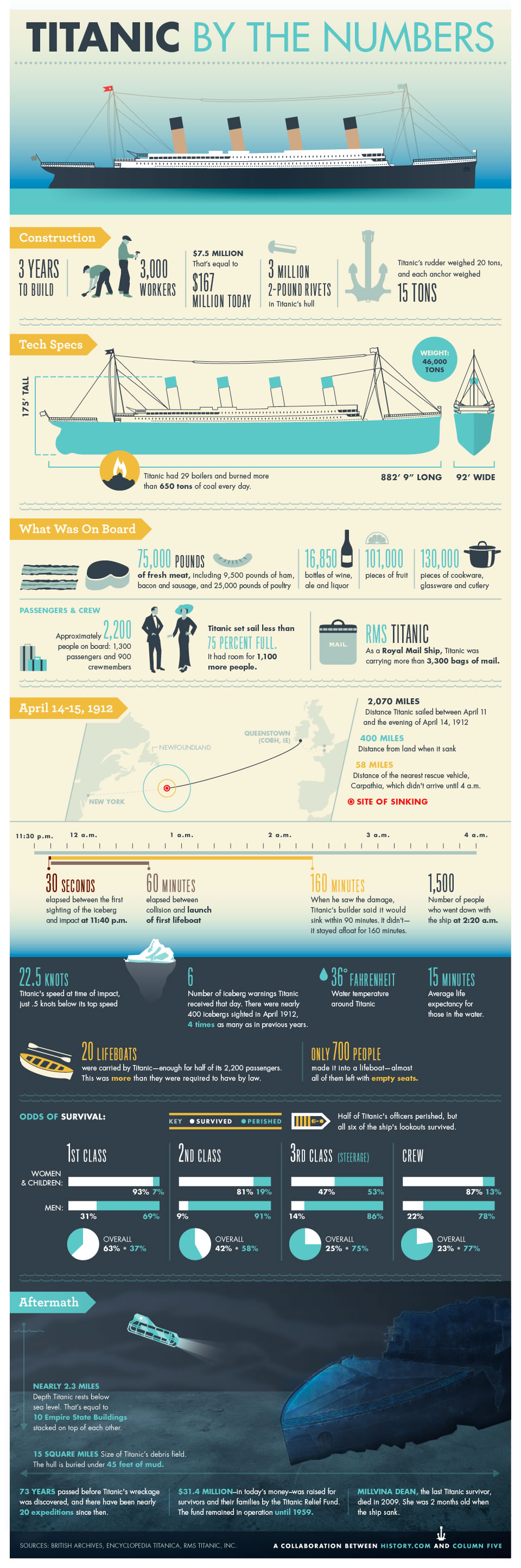
Infographic: Titanic By The Numbers
–
In honor of the 100th anniversary of the Titanic sinking, a fitting infographic from The History Channel: