Tag: infographic
-
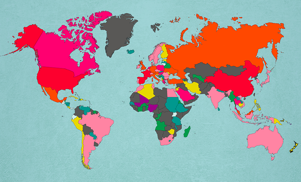
The Most Popular Countries In The World
–
I love maps, and especially this one. According to MoveHub.com, these are the top 50 countries by yearly visitors. Based on this, how about we take a trip to Mali, Nigeria, or East Timor? I was THIS close to going to East Timor last year while hanging out in Flores, Indonesia.. darn! Top 50 most…
-
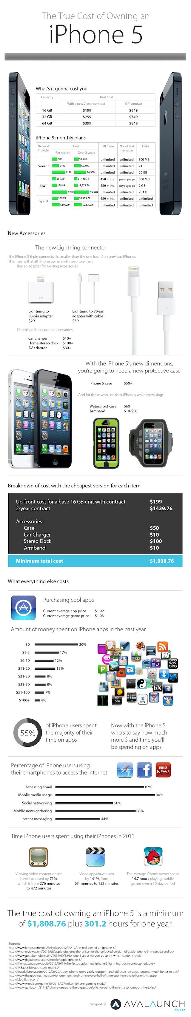
Infographic: The True Cost of Owning an iPhone 5
–
Thanks to snazzily-named internet marketing firm Avalaunch for this handy infographic breaking down the ownership cost of an iPhone5… Avalaunch via Gizmodo
-
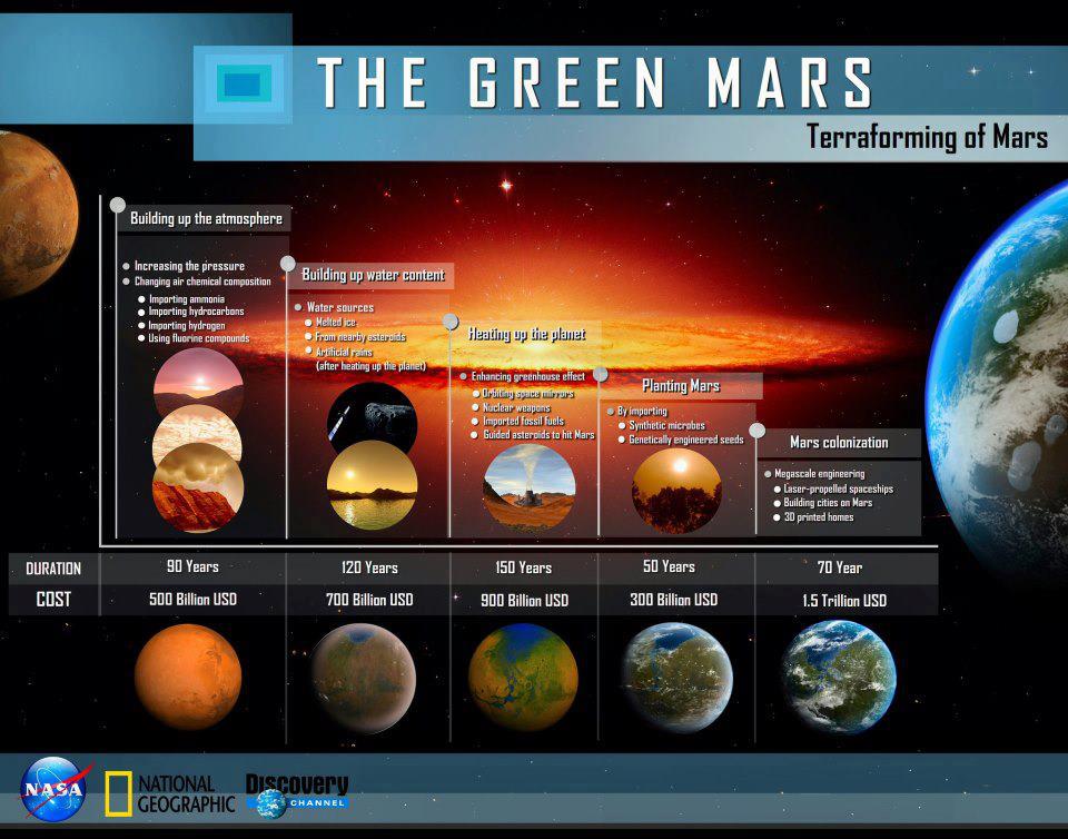
Infographic: Terraforming Mars
–
With the Curiosity Rover set out on its mission on Mars, we’re one more step closer to sending humans there. Here’s an interesting infographic from Discovery and NASA going over a possible budget and timeline for terraforming the red planet to create a habitable environment. Very very interesting….
-
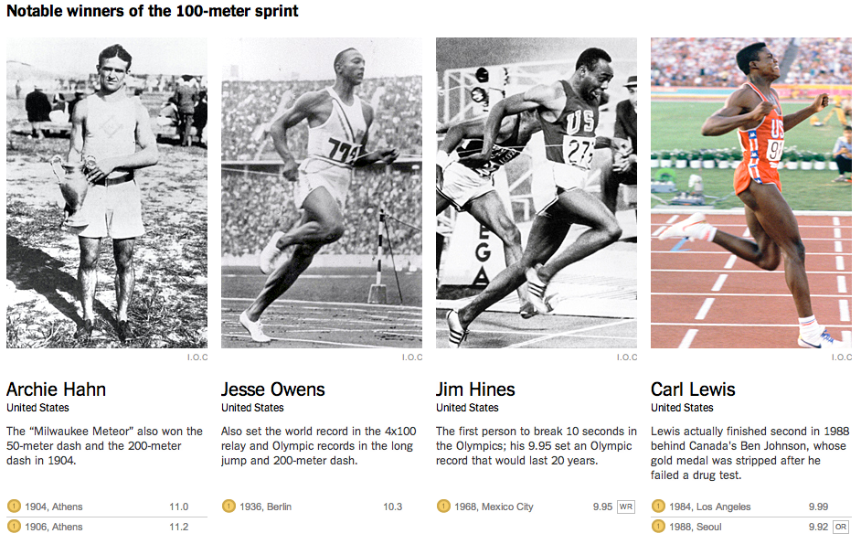
Faster and Faster at the Olympics
–
The NY Times recently posted this excellent explainer feature documenting how Olympic sports have gotten faster and faster over the years. The piece focuses on the Men’s 100-Meter Sprint, but covers other important events, like the 100 meter freestyle swim, and long jump. From NY Times: Based on the athletes’ average speeds, if every Olympic…
-
Explainer: The Crisis of Credit Visualized
–
Easily the most clear explanation of the credit crisis I’ve seen, with nifty infographics and great narration. Thanks to Jonathan Jarvis at Crisisofcredit.com. The Crisis of Credit Visualized via The Crisis of Credit Visualized – HD – YouTube. Found via Reddit
-
Infographic: Spaceships to Scale
–
Thanks to Science journalist Ananyo Bhattacharya for this awesome infographic of past, current and future space vehicles, drawn to scale. Found via BoingBoing. Cool – got call out from @BoingBoing http://t.co/nFlBuHsR << Je suis arrivé (ht @BL_Owens) — Ananyo Bhattacharya (@Ananyo) June 19, 2012
-
Introducing my Visual Resume
–
Infographics have gotten increasingly popular recently, and in response, a number of websites have cropped up to allow users to convert their job resume into a snazzy infographic. Using Visualize.me, I’ve created my own version. After you’re done being impressed with the infographics and years of experience I have working in interactive media, shoot me…
-
Infographic: Building The Case For Resunate – Does a Non-Traditional Resume Limit Your Odds?
–
Another job-related infographic for today – Does sending out one of those trendy Infographic Resumes, like what vizualize.me creates limit your chances of being positively evaluated by an automated Applicant Tracking System? This certainly makes the case to use Resunate, which lets you optimize your text based resume in real time to perform agains ATS’s….…
-
-
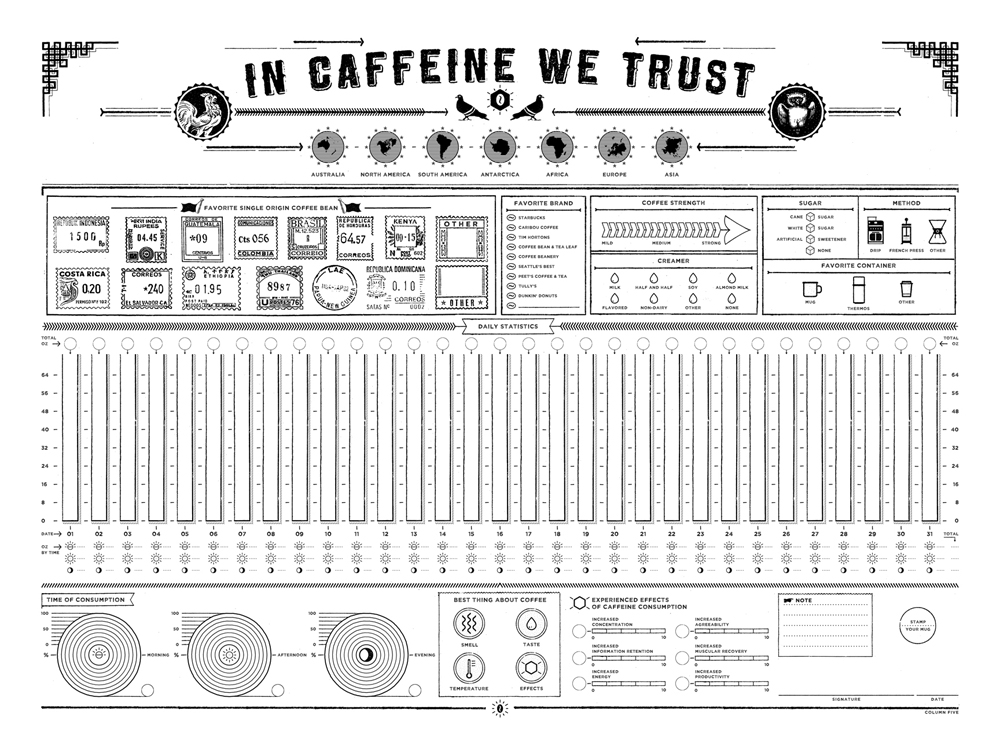
Infographic: In Caffeine We Trust
–
This time, and interactive caffiene tracker infographic from Column 5 Media.. Track your caffiene intake! In Caffeine We Trust: Infographic Print For Tracking Your Coffee Consumption Data.
-

Infographic: Volvo Ocean Race
–
Another great infographic from Column Five Media, in partnership with my former client Nowness, covering the Volvo Ocean Race. I’m especially interested in this one, since I spent a large part of the summer sailing around the Caribbean. I’d love to someday crew for this race…. and here’s my sailing resume! “Highlights of one of…
-
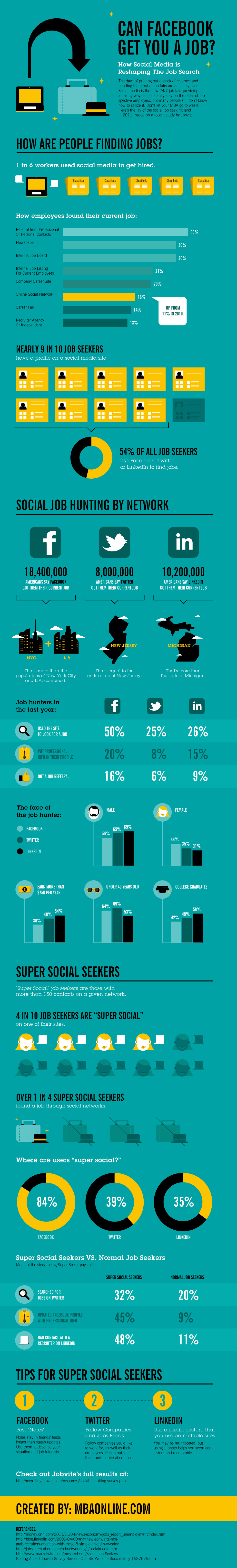
Infographic: Getting A Job on Facebook.
–
Another infographic for today, this time from MBA Online, and found via Mashable. Facebook great for making connections of all types, not just friend connections. In this infographic, we see just how powerful the social networking site is for making job connections…. Can Facebook Get You a Job? [INFOGRAPHIC].
-
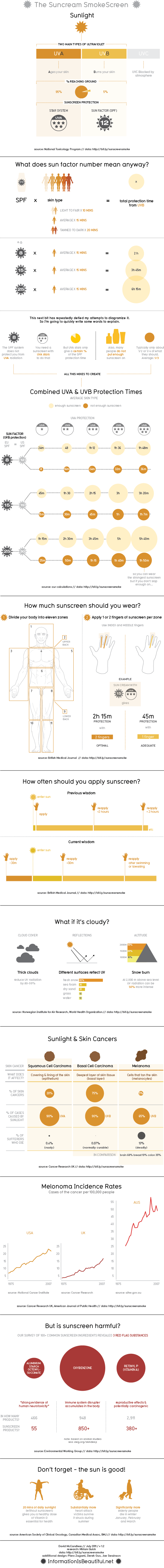
Infographic: The Sunscreen Smokescreen
–
Relevant for summer, especially since I’m spending a month in the water in both California and the Caribbean, here’s a nifty infographic about sunscreen. I use Neutrogena SPF 70. Notable with this infographic is that all of the data is backed up by a thorough Google Spreadsheet. The Sunscreen Smokescreen.
-
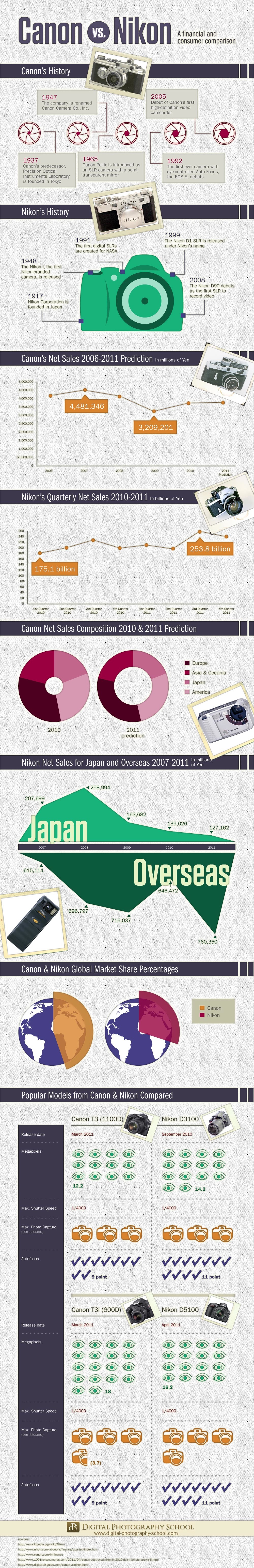
Infographic: Canon vs Nikon: a Financial and Consumer Comparison
–
Interesting infographic from Digital Photography School, comparing Canon Vs. Nikon. I’m personally in the Canon camp, but know that Nikon makes great products as well. Additionally, lately I’ve started to look at compact cameras from Panasonic, given that they use Leica lenses. Canon vs Nikon: a Financial and Consumer Comparison [INFOGRAPHIC].
-
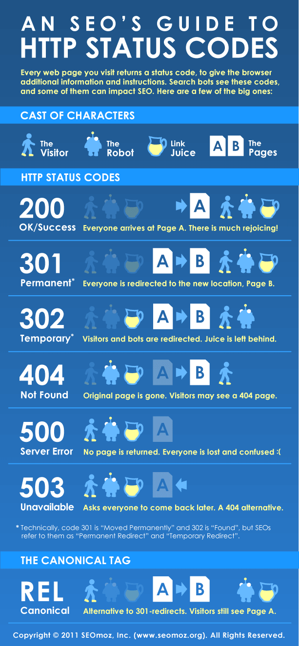
Infographic: An SEOs Guide to HTTP Status Codes
–
Quick infographic today from SEOmoz – An SEOs Guide to HTTP Status Codes. May sound boring, but configuring your server to give correct status codes can make or break a site’s SEO potential. An SEOs Guide to HTTP Status Codes An Infographic | SEOmoz.
-
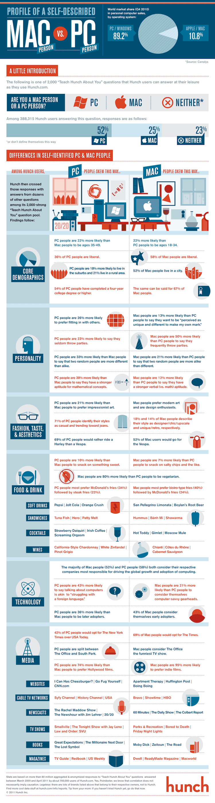
Infographic: How Are Mac & PC People Different?
–
Another great infographic, this time courtesy of friends over at Hunch. Source: Hunch Blog Found via: Mashable Listening To: Metronomy – Everything Goes My Way
-
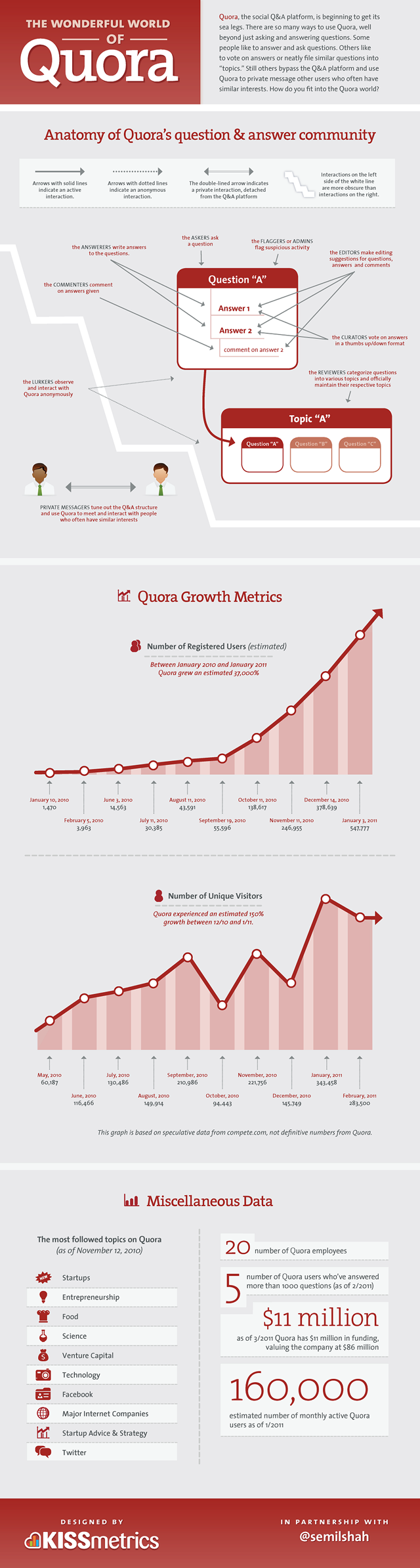
Infographic: The Wonderful World of Quora
–
Quora has been heating up lately, and attracting attention from people spanning multiple industries, including top execs. The site is an open forum for topical questions and answers, allowing anyone to ask anyone anything – with interesting results. So, how is Quora actually performing? Here’s the breakdown, from KISS Metrics:
-
-
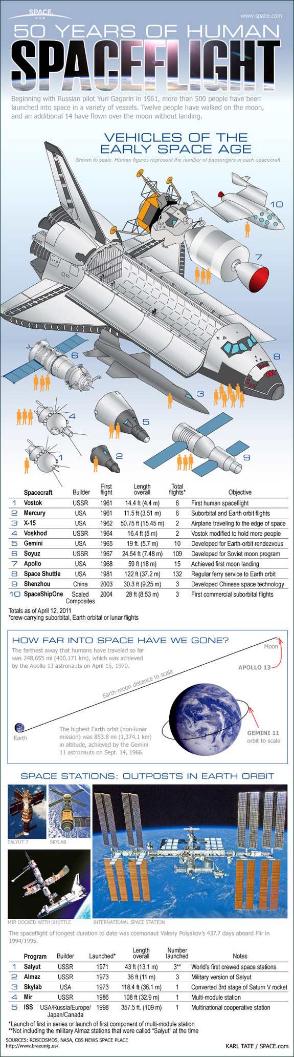
Infographic: 50 Years of Human Spaceflight
–
Another interesting infographic, this time from Space.com:
-
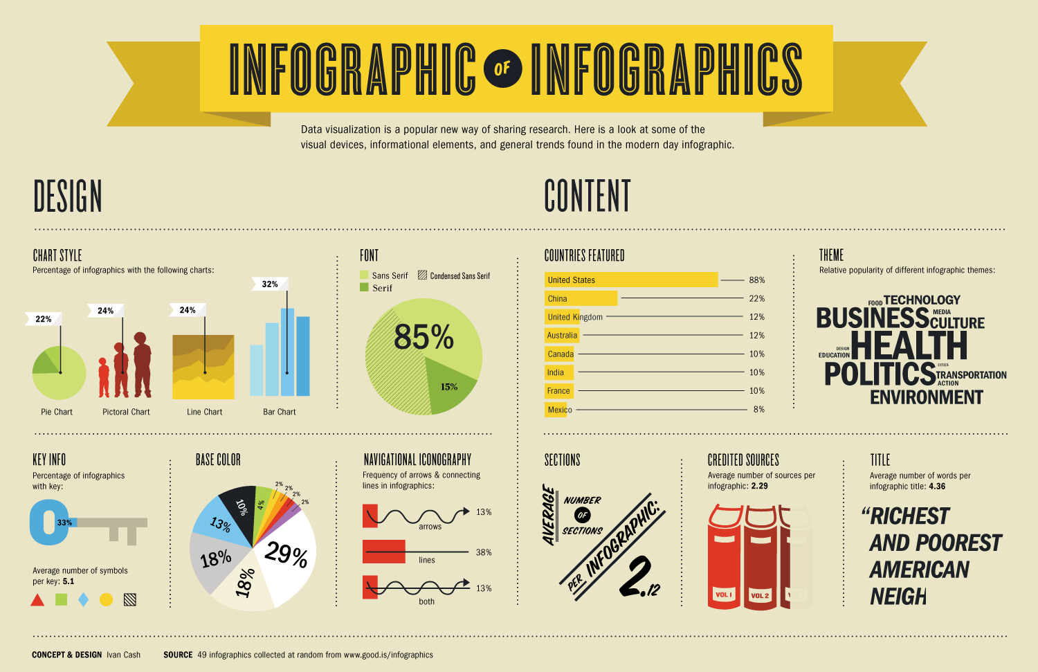
Infographic Overload: An Infographic About Infographics
–
Ivan Cash, thank you (?) for this crazyness: