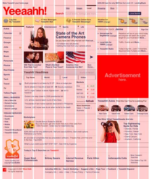
The fluid grid layout methodology is an emerging method for making websites instantly and optimally accessible from any device, with any size screen. Hopefully, we’ll start to see wider spread usage of these new features in CSS3, so new websites are designed with this kind of functionality in mind.

I actually came across this a few months ago when researching design and code ideas for my personal homepage. Jeremy Keith’s “Adactio” homepage and blog extensively uses both a fluid grid layout, as well as interchangeable and user selectable css “themes”, that apply to the entire site. All layout functionality is contained within one global css file, which applies the fluid grid and all other styles. Keith’s site even goes as far as removing the background, and most of the page graphics when viewing on a mobile device, for optimal clarity.
Especially for Mobile, implementing dynamic layout methods like this could easily give sites instant usability. Enabling the same site, with the same urls and content to be viewed on both desktop and mobile browsers could become increasingly more relevant. I think in many cases nowadays, the notion of creating completely separated desktop and mobile optimized sites is fading. Creating two sites, each aimed at a particular medium, but with similar content could conceivably set a site up for huge duplicate content issues and SERP index dilution. By building one unified site that can be presented to both desktop and mobile users, search relevancy, interlinking, and user experience is consolidated and optimized. Of course, there are absolutely going to be cases where a mobile-specific site, separate from the desktop site, is best. Sites with a focus on features and user interaction need a mobile-specific UI. However, for sites with primarily content, consolidation could be the way to go.

Rand Fishkin of SEOmoz (as we discussed earlier today) recently wrote about the future of mobile search and SEO. One of the big trends that was mentioned was consolidated mobile and desktop search engine results. The only way that this is going to smoothly happen is with the help of dynamic layout standards like Adaptive CSS.
A single set of SERPs – I searched for a good 20 minutes on my laptop and Android phone without finding a query where the web results are in a different order (both are location-aware to “Seattle, WA”)
As for specific implementation, there are a couple of good tutorials on Adaptive CSS and Fluid Grid Layout – Smashing Magazine’s Tutorial on Adaptive CSS and Fluid Grid Layout covers almost the entire range of options, including:
- Fluid Layout Using A Grid
- Adaptive Content
- Images In A Fluid Layout
- Integrating jQuery
- Smart Column Behaviour
- Text Sizing for Clarity
Grid Layout resizing demo from ProMedia Corp
Blogs are great candidates for using a fluid grid layout. There are a bunch of great sites already doing this, with my site hopefully being added to the list very soon. A new popular WordPress theme using Fluid Layout is Grid-A-Licious https://suprb.com/apps/gridalicious/, and in my research, most blogs with this “boxed” style are using this theme, or a variant. Some examples:
- Reform Revolution uses basic grid scaling, based on the width
- Space Collective
- Fluid 960 Grid System – Source is available on Github
- Fluid Grids tutorial on A List Apart

Comments
One response to “Web Design for Desktop & Mobile Consolidated Compatibility: Adaptive CSS3”
[…] users3 Methodologies (ED – I wrote about CSS3, Grid Layout, and Media Queries previously –