Today’s infographic is from the Oxford Internet Institute. My own contribution to this project is through my own set of geotagged photos on my Flickr Photostream. Additionally, I did a writeup a while ago on real world field trials of geotagging photos while backpacking in Alaska.
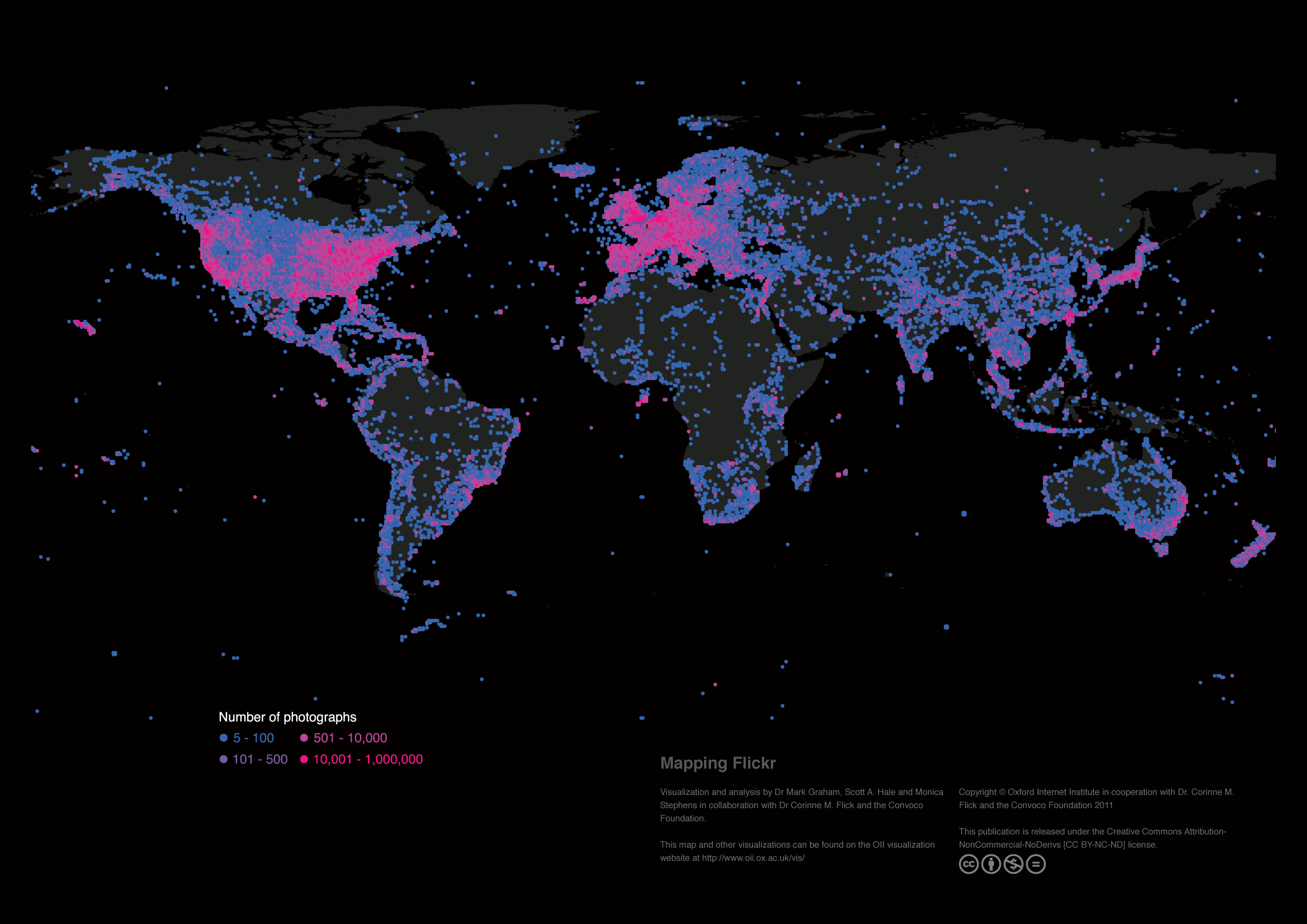
Images are an important form of knowledge that allow us to develop understandings about our world. Flickr is the world’s most used and most popular public repository of photographs and currently hosts over five billion images. This map reveals the global geographic distribution of geotagged images on the platform, and thus reveals the density of visual representations and locally depicted knowledge of all places on our planet.
Data
Each point on the map indicates the total number of geotagged photographs uploaded to Flickr at that location. All geotagged photos were collected through Flickr’s application programming interface (API) using a custom designed program on April 1, 2011. Our program downloaded the count of geotagged photographs in every 0.5 x 0.5 degree latitude-longitude square on the Earth’s surface. Due to the convergence of lines of longitude at the poles, our sampling boxes become larger as they approach the equator.
Findings
As might be expected, the largest concentrations of photographs can be found in some of the world’s most populated places. Much of Western Europe, North America and East Asia are covered by dense layers of virtual representation. However, the density of photographs is not simply a factor of population. Potentials for participation are limited by both censorship of the platform (e.g. in Iran) and the presence of more popular services (e.g. in China). In the rest of the world, the patterns on this map point to images being mostly created by people in the world’s wealthiest and most highly connected regions. The stark contrast in the number of photographs covering Mexico and the United States and the lack of dense clusters of images in the most populated parts of Africa (e.g. coastal West Africa) reinforces this point.
Visualization and analysis by Dr Mark Graham, Scott A. Hale and Monica Stephens in collaboration with Dr Corinne M. Flick and the Convoco Foundation.
This map is taken from the following publication: “Graham, M., Hale, S. A. and Stephens, M. (2011) Geographies of the World’s Knowledge. London, Convoco! Edition.”
Visualizing Data at the Oxford Internet Institute – Mapping Flickr.

