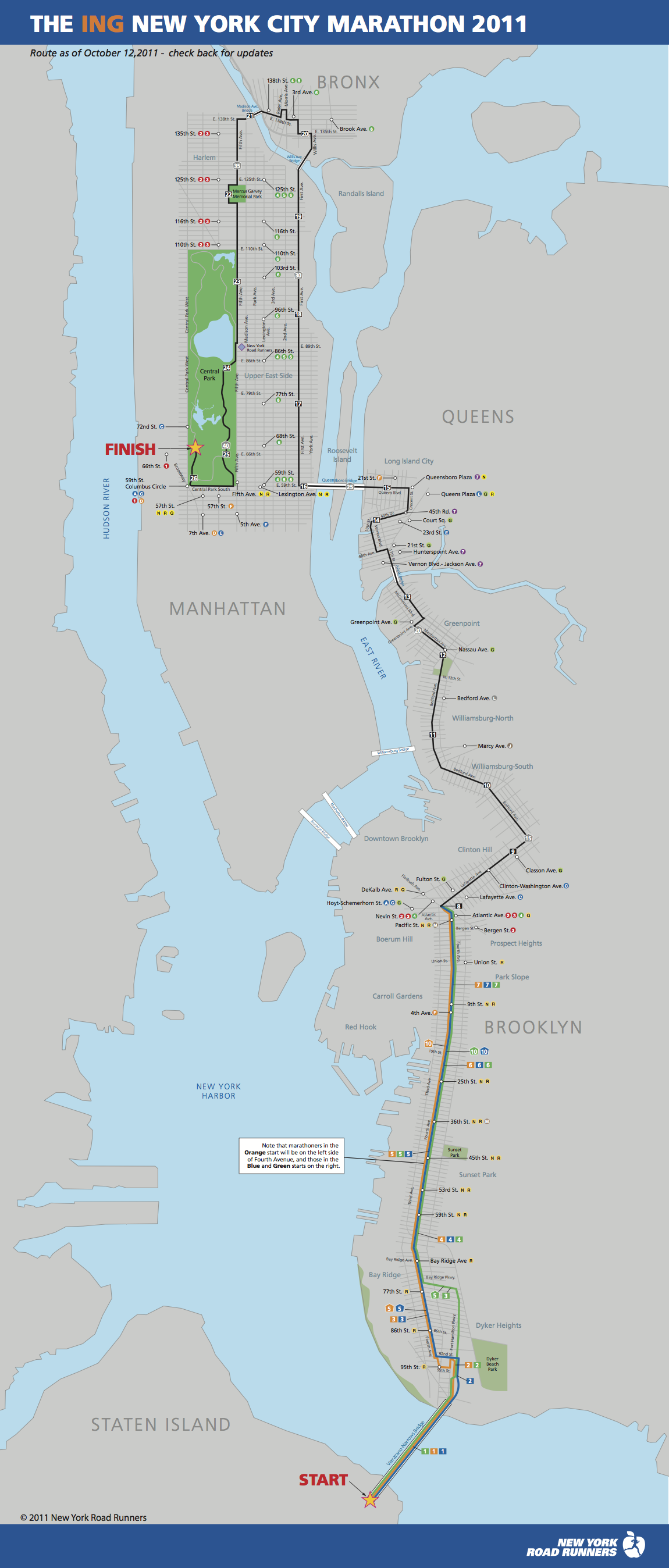
Great cheat sheet, courtesy of Living In The Stills:
Category: Infographic
-

Infographic: How To Optimize Your Life With An iPad
Nextworth has published a nifty infographic illustrating all of the novel uses for the iPad. Since the release of the “New” iPad with high res Retina Display, there are even more uses – certainly including geofencing with the iPad, as well as iPhone.
-
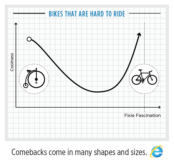
Infographic: Internet Explorer’s Ups and Downs
Internet Explorer, I don’t like you. You stunted the growth of the web, and continue to plague me in my development efforts. But apparently some people are beginning to like your new version, as this infographic from Column Five tries, and fails to illustrate. Internet Explorer still sucks, even after MSFT tries to hip it up with cool looking infographics from Column Five, a cool company.
Thanks co-worker Pallas for the link!
Internet Explorer Infographic: The Browser You Loved to Hate – Column Five Media.
-

Email Overload! My Year in Emails According to ToutApp
 At the end of last year, startup ToutApp released an online tool that analyzes my entire gmail account and provides an interesting statistical breakdown of email trends.
 A few excerpts from the report:


ToutApp also makes a nice business networking iPhone app, which simplifies the network/instant followup workflow when meeting people. A competitor to Bump? Maybe…https://www.youtube.com/watch?v=oM2RQV08R_8
-

Infographic: AirBnB’s Explosive Growth
Since I’ve been traveling for the past few months, I’ve used AirBnB to fill my NYC apartment. Here’s a nifty infographic charting their explosive growth in over the last few months:
-
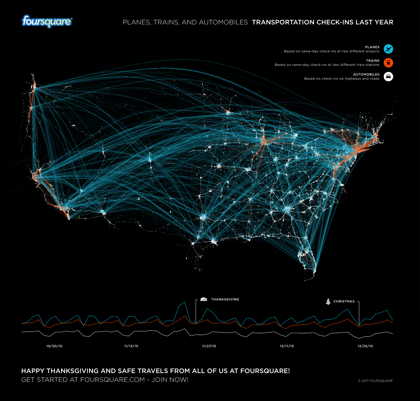
Infographic: Transportation check-ins on foursquare
Checking in on Facebook is addictive, and the addiction for me is certainly fueled by getting badges. My most proud badge is my “Jet Setter” badge, which is awarded after a bunch of checkins at airports. Although users can get each badge only once, Foursquare has recently added the ability to “level up” on a badge, as a reward for even more checkins. I’m slowly leveling up on my Jet Setter badge – and lots of other people are too. Here’s a cool infographic from FourSquare depicting checkins to major transportation hubs, and serves to map out the most common flight routes of 4sq users…
-
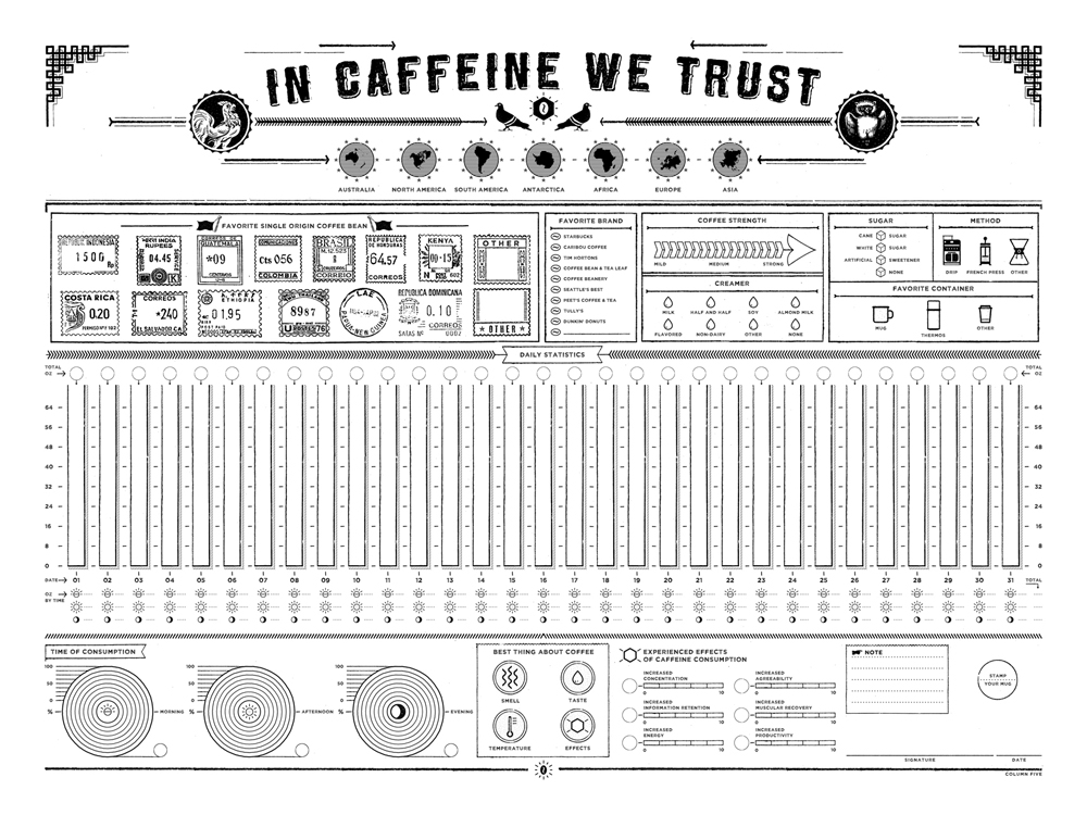
Infographic: In Caffeine We Trust
This time, and interactive caffiene tracker infographic from Column 5 Media.. Track your caffiene intake!
In Caffeine We Trust: Infographic Print For Tracking Your Coffee Consumption Data.
-
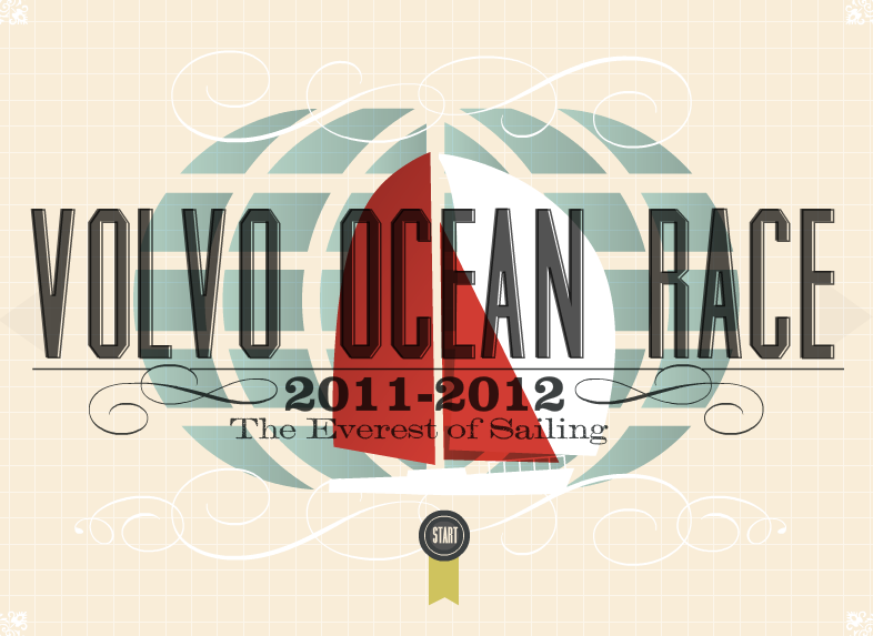
Infographic: Volvo Ocean Race
Another great infographic from Column Five Media, in partnership with my former client Nowness, covering the Volvo Ocean Race. I’m especially interested in this one, since I spent a large part of the summer sailing around the Caribbean. I’d love to someday crew for this race…. and here’s my sailing resume!
“Highlights of one of the sporting world’s most challenging events, the Volvo Ocean Race, are captured in this inspired infographic created by Newport Beach-based creative agency Column Five Media. Featuring pirated waters and severe weather extremes, the grueling quadrennial race is rife with danger. Founded in 1973, the competition tests physical endurance, strategy and sportsmanship as a handful of crews race each other across the most treacherous ocean expanses on the globe. Kicking off in October from Alicante, Spain, the first leg of this year’s race saw the teams journey some 6,500 nautical miles (12,308km) to Cape Town, South Africa. After 21 days the Spanish Team Telefónica arrived first in port: “As you can imagine we are really happy, this is a great victory for the team,” says Telefónica skipper Iker Martínez, the 33-year-old two-time Olympic medalist. In a testament to the brutal nature of the race, three of the six teams retired from the first leg before the finish line. “When we were battling with Team Puma for the lead, their mast broke and we were left out there alone,” continues Martínez. “From there it was more about not breaking anything, and being careful.” As the second leg commences, the teams take sail for Abu Dhabi this Sunday to spend the holidays at sea as they transition from the Atlantic into the Indian Ocean and cross 5,420 nautical miles (10,056km) to arrive in the Emirates on New Year’s Day.”
-

Infographic: Getting A Job on Facebook.
Another infographic for today, this time from MBA Online, and found via Mashable. Facebook great for making connections of all types, not just friend connections. In this infographic, we see just how powerful the social networking site is for making job connections….
-

Infographic: Auto Accident Map Of Death
 Fresh from Buzzfeed, via Animal New York and Bucky Turko, here’s an interactive map of auto accidents – scary to see how many they are, and where they tend to crop up. Stay safe on the roads for the upcoming holiday season!
 -

xkcd: Map Projections
I usually don’t post direct XKCD comics, despite the fact that they’re all fairly brilliant. But this one really stuck a chord for me, since I love to travel.
So, where do I fall on the chart? I have an inflatable 3D globe at home, and yes, I’m very clever. Aside from that, I also have a couple of nautical charts and topo maps hanging up, which use a different projection method to visualize smaller sections of land and sea.
Looking forward to making it across the entire map. no matter which projection!
-
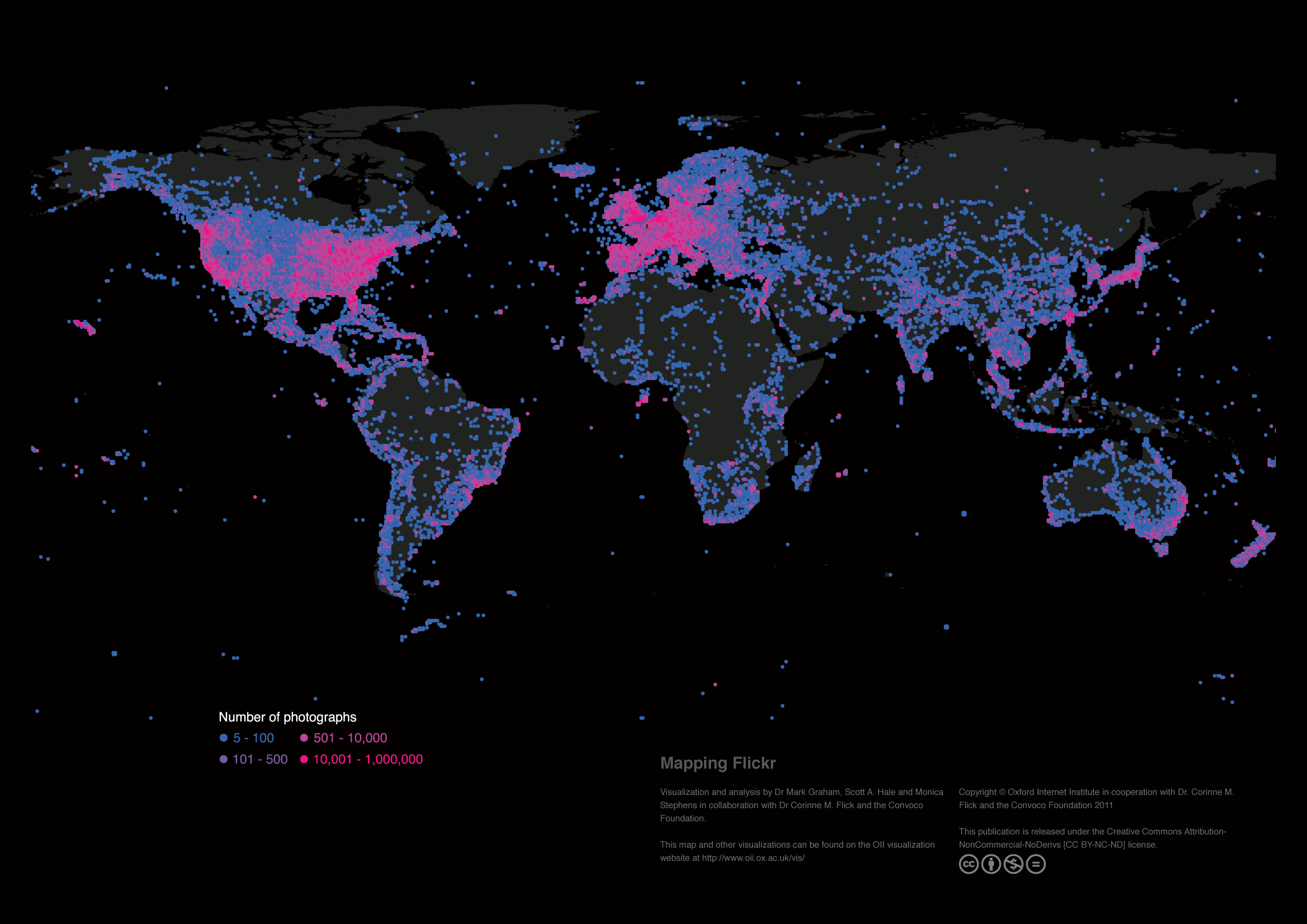
Infographic: Mapping Flickr
Today’s infographic is from the Oxford Internet Institute. My own contribution to this project is through my own set of geotagged photos on my Flickr Photostream. Additionally, I did a writeup a while ago on real world field trials of geotagging photos while backpacking in Alaska.
Images are an important form of knowledge that allow us to develop understandings about our world. Flickr is the world’s most used and most popular public repository of photographs and currently hosts over five billion images. This map reveals the global geographic distribution of geotagged images on the platform, and thus reveals the density of visual representations and locally depicted knowledge of all places on our planet.
Data
Each point on the map indicates the total number of geotagged photographs uploaded to Flickr at that location. All geotagged photos were collected through Flickr’s application programming interface (API) using a custom designed program on April 1, 2011. Our program downloaded the count of geotagged photographs in every 0.5 x 0.5 degree latitude-longitude square on the Earth’s surface. Due to the convergence of lines of longitude at the poles, our sampling boxes become larger as they approach the equator.
Findings
As might be expected, the largest concentrations of photographs can be found in some of the world’s most populated places. Much of Western Europe, North America and East Asia are covered by dense layers of virtual representation. However, the density of photographs is not simply a factor of population. Potentials for participation are limited by both censorship of the platform (e.g. in Iran) and the presence of more popular services (e.g. in China). In the rest of the world, the patterns on this map point to images being mostly created by people in the world’s wealthiest and most highly connected regions. The stark contrast in the number of photographs covering Mexico and the United States and the lack of dense clusters of images in the most populated parts of Africa (e.g. coastal West Africa) reinforces this point.
Visualization and analysis by Dr Mark Graham, Scott A. Hale and Monica Stephens in collaboration with Dr Corinne M. Flick and the Convoco Foundation.
This map is taken from the following publication: “Graham, M., Hale, S. A. and Stephens, M. (2011) Geographies of the World’s Knowledge. London, Convoco! Edition.”
Visualizing Data at the Oxford Internet Institute – Mapping Flickr.
-

Megainfographic: Earthscraper
This one comes from architecture and design site eVolo, and is by far one of the most outlandish subterranean building ideas I’ve ever seen. I’m not sure which I’d rather live in, this upside down underground building, or one of those decommissioned nuclear missile silos for sale on eBay. Anyway, very interesting infographic…


“The Earthscraper preserves the iconic presence of the Zocalo and the existing hierarchy of the buildings that surround it. It is an inverted pyramid with a central void that allows all habitable spaces to enjoy natural light and ventilation. The first ten stories are dedicated to a pre-Columbian museum. The next ten stories are retail areas and housing while the deeper 35 stories are offices.”
-

VideoInfographic: The Value Of Data Visualization
Column Five media consistently produces great infographics, many of which I’ve reblogged on my site.
Their latest kickass data presentation is this video illustrating the power and value of infographics, in motion infographic form. Enjoy!
-
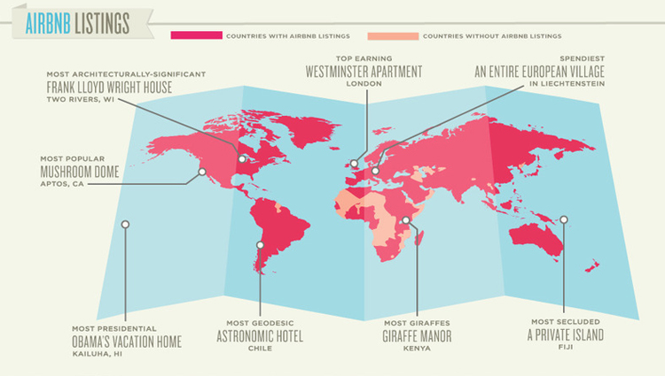
Infographic: Airbnb, the Expedia Alternative for VC Moguls
Another day, another great infographic. And another great piece of news about fast growing website AirBnB. I’ve been an AirBnB traveler and host for some time now, and absolutely love the site. Here are two infographics covering their explosive growth, coutesty of Fast Co Design.


Infographic of the Day: Airbnb, the Expedia Alternative for VC Moguls | Co. Design
-
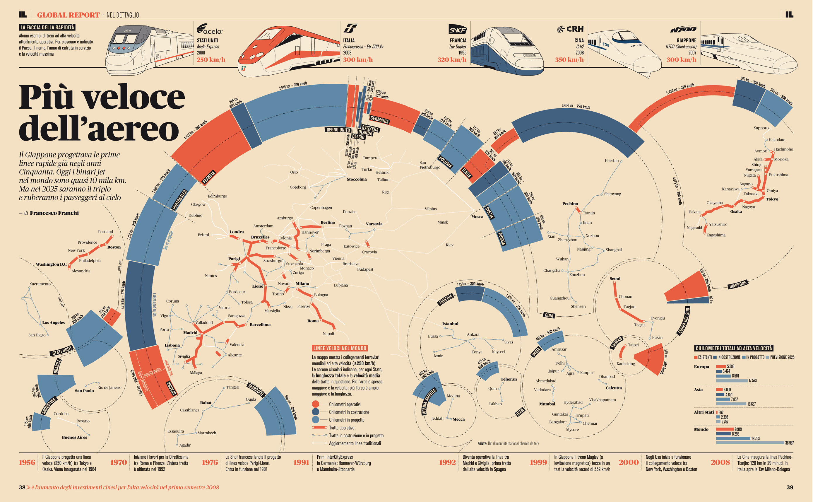
Metainfographic: What is an Infographic?
I post infographics on my blog, a lot. Some are funny, some are informative, but they’re always interesting. Lately I’ve been noticing a bunch of great ones from Column Five Media – they seem to be generating great graphics with good regularity, and often times sending them out to partner websites for distrubution.
Now, Ross Crooks over at Column Five have made a great writeup going over the process of infographics, and some good terminology to know. Be sure to read Crooks’ detailed breakdown of infographics, and check out a few of his examples below.

Infografica sulle reti ferroviarie mondiali ad alta velocità di Francesco Franchi . Found via Column Five Media 
From protests to rallies, marching on Washington has historically been an indicator of the nation’s political attitudes. However, the end of official crowd counting in 1995 has made finding accurate attendance figures for these marches increasingly difficult, because the numbers vary greatly among different sources. The blog Death by Media crunched the numbers based on aerial photos of the capitol mall and we decided to visualize the probable and maximum possible attendance numbers for the major rallies since 2000. We created this infographic for GOOD. – Column Five -

Infographic: The World Trade Center – Reborn
This week is my one week back in NYC, before I head out again on another adventure. Being back in the city, even for a short time, has been great. I’ve caught up with a bunch of friends, gotten back into the groove of being a “New Yorker”, and rediscovered a few city sights. It’s interesting going away for a while, because upon return, I’m looking at the city with renewed eyes. One thing I noticed while walking along the West Side pathway the other day was the progress being made on the new World Trade Center site. Progress on 1 World Trade Center seems to be coming along, and it’s great seeing the new building gain height. I’m eagerly awaiting the opening of the building, and a tour to check out all of the cool new tech that goes into it.
In preparation, I found this infographic going over some of the numbers and stats involved in the building of this massive structure, courtesy of my former client History.com and Column Five Media. (found via Reddit)
-

Infographic: The Sunscreen Smokescreen
Relevant for summer, especially since I’m spending a month in the water in both California and the Caribbean, here’s a nifty infographic about sunscreen. I use Neutrogena SPF 70. Notable with this infographic is that all of the data is backed up by a thorough Google Spreadsheet.

The Sunscreen Smokescreen.


